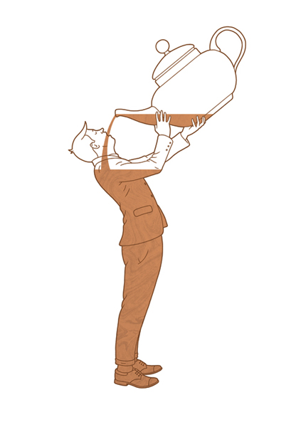
Today I've been making some collages relating to my project, 'Journeys', using found images.
To begin with, I looked at dinosaurs, as I'm interested in the idea of journeys through time.
When I created the above image I was thinking about the possibilities of dinosaurs if they lived now, and tried to make the dinosaur look like a pet taking someone for a ride, or he could even be a teacher. Who knows, they may have been more intelligent than us!
I was thinking about how modern an idea 3D imagery is in comparison to the prehistoric period, so I tried to create what a 3D image looks like before you put your 3D specs on.
When photocopying the image, my printer gave up the ghost and gave me this fantastic piece that I could obviously never repeat intentionally. It made me think of how dinosaurs faded out, and how species have become extinct, but there are still traces of what they once were.
These images are a different take on my theme, as I was focussing on travel.
Even though these women are having some sort of woman vs spaghetti competition, the image reminded me of someone vomiting, as visually it is a bit disgusting. As one of the objects suggested to me in my survey last week was a sick bag, I decided that motion sickness could be an interesting journey-related topic to cover.
I used brown paper as the material was similar to that of a sick bag, and layered the image to suggest movement. I like the colour palette as it looks quite retro - especially with the antique omnibus ticket!
Due to my fascination in fairgrounds, I thought it could be quite interesting to place the women on a ride. I photocopied them with a red filter to suit the colour palette,which I think looks really effective.
This piece in particular reminds me of Roy Lichtenstein's work because of the primary colours used, and the pointillism-esque patterns of dots and hexagons.
I like the fact that the women are smiling as it made me think of the thrill and fear that rides make us feel.
The work of J.P. King inspired me for these pieces, as his use of positive and negative shapes and their placement is really intriguing, as the layering suggests time and movement. I also like his use of colour as it is fairly limited and doesn't take attention away from the central image.